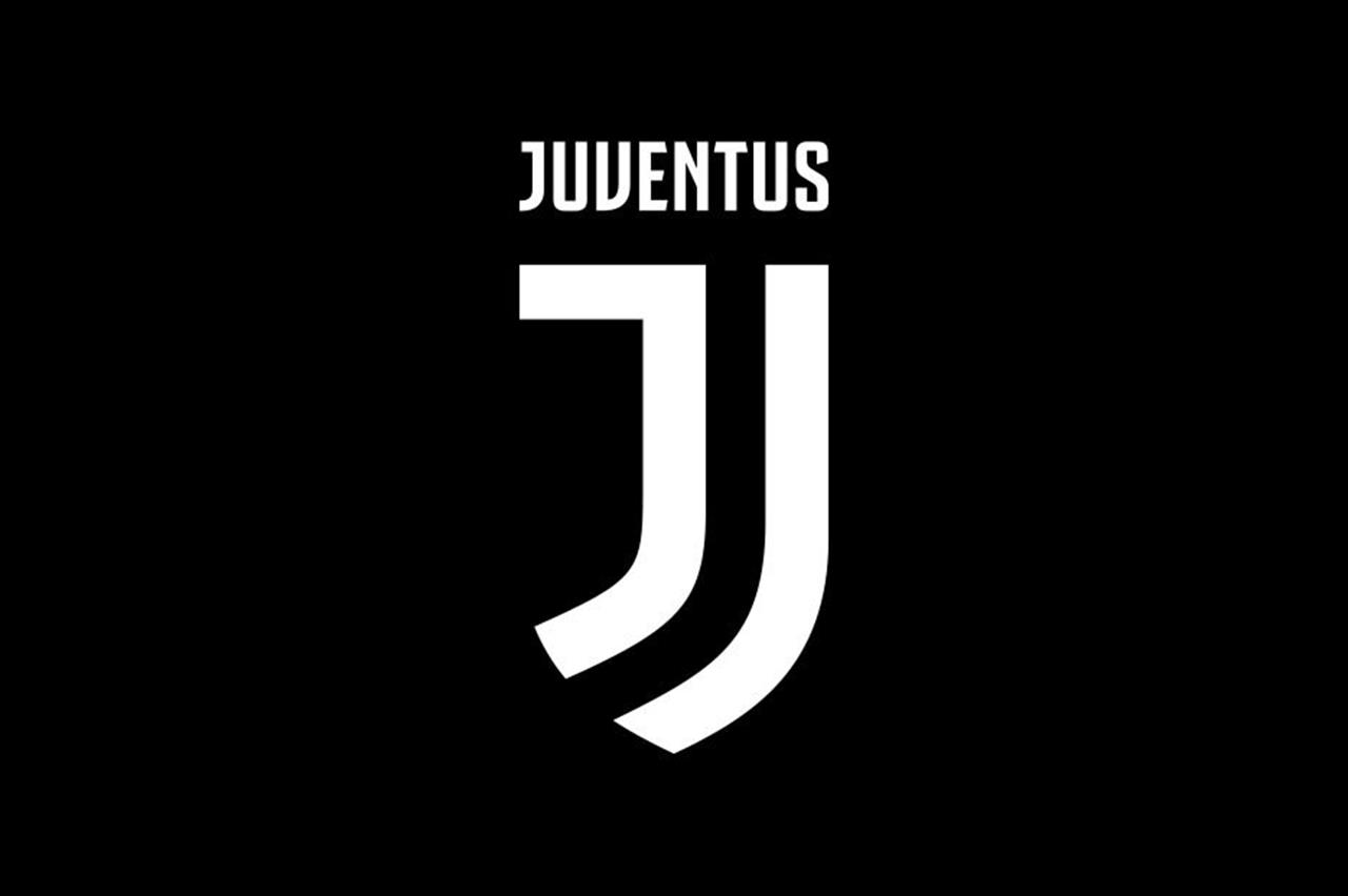
New year, new dress. The Old Lady gets a makeover, or at least part of it. In fact, the news of these days is new emblem of Juve which will be possible to admire from next season. A revolution if we consider the importance that the current symbol has always had in Juventus history.
Stories of Juventus symbols and crests
Since its foundation, Juventus had left the base of its emblem unchanged. The classic oval with inside the black and white stripes, the writing Juventus and the bull, symbol of the city of Turin, in the lower part. A few small restylings over the years, but never major changes. The number of stripes, the presence or absence of stars representing the league titles and the color of the background varied. Small tweaks just to give that feeling of graphic renewal or to pay homage to some particular event. Homage like the one for the Savoy family in the 20s with the inclusion of a blue background.

On the other hand, a significant variation occurred to the coat of arms at the end of the 70s with the rampant zebra. A completely new emblem, which in fact distorted the classic emblem. A deliberate choice to refer above all tooptical art, a very popular abstract art movement at the time. However in those years Juve kept two symbols: the one with the stylized zebra and the classic oval version. Therefore it is not entirely correct to indicate this variant as an official emblem.

Starting from the 90's the Old Lady returned to present herself with a single coat of arms: the classic one so dear to the fans and a symbol of continuity. Small changes were made in 2004, but always with the same base. Changes maintained until 2017, the year of the new symbol of the most successful team in Italy.
The new coat of arms
A little less than two years. This is the time that the Interbrand, a marketing company based in Milan, employed in the creation of the new emblem. A necessary time given the importance of the club he will represent in the future. The result is a simple yet meaningful symbol. A stylized J to refer to the name Juventus. But also a tribute to the lawyer Agnelli, in love with that letter even outside the Juventus context. There is also no shortage of optical games with related references to the shirt and the shield. A deliberate choice to capture the attention of the new generations and enter a market linked not only to the football world. The goal is in fact to create a Juventus brand, an all-Italian brand capable of invading multiple sectors.
The reactions of the fans
But how was the new coat of arms received? Juventus fans are very tied to tradition, but over time they have shown that they know how to welcome the news. An example is given by the Juventus Stadium inaugurated in 2011. For some, demolishing the historic Delle Alpi to build a new stadium could seem like a heresy. However, the great marketing campaign and, above all, the possibility of having a state-of-the-art stadium in Italy and in the world convinced the Juventus people. In the space of a few years, the Stadium has become a fort where Juventus have won 5 league titles in a row. And with the new emblem the reactions seem the same. A bit of initial skepticism, but day after day on social media the Juventus supporter seems to appreciate the new logo more and more. Many teased from other fans, but basically it's part of the game.

And there is no shortage of unpleasant inconveniences like that of Kevin and his tattoo. At the beginning of January the Juventus fan, for the love of his team, had the Juventus emblem tattooed. And after less than two weeks the owner presented the new one. A real bad luck, but Kevin jokes and does not deny the possibility of tattooing the new logo next to the current one.
Not only Juventus: the era of new logos
Juventus is just the latest in a series of “stylistic” renovations that have taken place in recent years. In 2013 the new American ownership of AS Roma decided to modify the historical emblem with some tweaks. The goal was always to find a symbol that would attract the attention of other markets as well. However, despite the minimal changes, fans initially boycotted the new crest due to their strong link with the previous one.
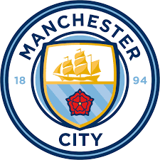
In 2016 Manchester City completely changed their face with a brand new emblem. Many greetings to the eagle and the Latin inscription, space for the seafaring tradition. Too bad that the city of Manchester does not even overlook the sea.
Last example is that of Atletico Madrid. The Spanish club, a little less than a month ago, presented the new logo. A restyling of the historic emblem in a modern key with softer lines, less bright colors and simpler designs. But the teams that in recent years have been revising their symbols are many. And the goal is always the same: to get out of the pitch and invade the market in every sector.
